Apr
25
2014
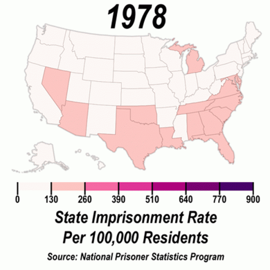
Data Visualization: Rise of U.S. Incarceration 1978-2012
It’s no secret that I love data and data visualization. David Mendoza of the Mendoza Line has illustrated the rise of incarceration in the U.S. from 1978 to 2012. Click HERE to get the full effect of the visualization.

