Jul
06
2010
Visual Image of Prison Expansion 1980-2000
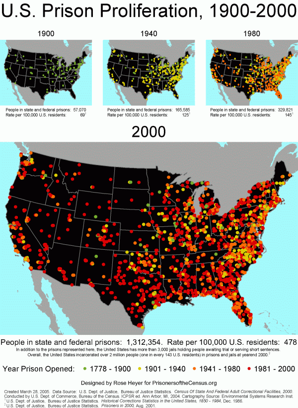
I am completely obsessed with data visualization and infographics. I have been an Edward Tufte groupie for years. I love data visualization because I know that most people don’t read research studies and yet those studies often provide very important information that needs to be conveyed to the general public. It’s important to find better ways to translate data for the public so that they can be used to inspire social action. Below is a good example of an infographic that illustrates the expansion of prisons over 30 years.

Expansion of Prisons
This is an image from the Prisoners of the Census website.
